My process coding the 'Easybank' challenge
Hey there! Took you a while, huh? There’s a lot of shenanigans happening in the last 4 months. Long story short: I moved into Bangkok, went into college pursuing a Computer Engineering degree on the weekends, and got a job making smoothies to sustain my lifestyle and tuition fees. I know, totally not related to SWE at all, but I saw it as a great oppportunity. Surely I’ll expand on why I think so.
Since then, I’ve been serious with front-end development a whole lot more. It is a challenging aspect of web development once you get your feet wet for long enough, but some people may undermined or overlooked how hard it is just because there are designs to look for. I still think it’s hard. And that’s why I’m doing a challenge.
Here’s the challenge if you wanna try. And here’s my solution for it along with the source code.
I wanna expand my process on building the “Easybank” webpage challenge from Frontend Mentor. How I built it, what did I use, complications and frustrations, etc. So, let’s go with their structure on this one.
🔧 Built with
- React - the framework
- Vite - the dev tools
- Tailwind CSS - the styles
- TypeScript - the “language”/type check solution
- Radix UI - the functional UI components library
💡 What I learned
You know, after I got a hang of Angular during my internship days, I’m able to pick up React pretty good on this project. It’s pretty lightweight and flexible when compared. But I brought file structuring I learned from Angular into React, which is something that React didn’t provide. I was able to understand basic framework fundamentals like interpolation, conditional rendering, for loop rendering, etc. fast and just enough to call this project good.
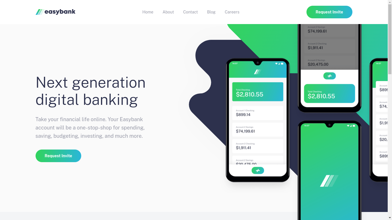
I spent most of my time scratched my head during the “Hero” section. Like, layering 2 images in the webpage?! Fuck me. My initial reaction was to create 2 <img> elements and put them together in a <div>. Then ordered them in a relative-position <div>. Something like:
<div className="relative">
	<img src="/images/bg-image.svg" className="absolute -z-1" alt="background image" />
	<img src="/images/hero-image.svg" className="absolute" alt="hero image" />
</div>
While this resulted in hero image being layered on top of the background, it’s a torture to adjust position and sizing. It also fucked up element structure big time, too. And then I found the solution to this.
The solution was to put images in pseudo elements: before and after respectively. Then set min-height to them so the images would show up. You then went to town on adjust position and sizing until it looked close enough, which resulted in this monstrosity of a class:
.hero-img {
    @apply bg-[url('/images/bg-intro-mobile.svg')] bg-no-repeat relative bg-center bg-cover min-h-[373px] before:bg-[url('/images/image-mockups.png')] before:size-full before:absolute before:bg-[center_bottom] before:bg-no-repeat before:bg-[length:90%] lg:bg-none lg:before:bg-[url('/images/bg-intro-desktop.svg')] lg:after:bg-[url('/images/image-mockups.png')] lg:after:absolute lg:before:bg-[length:122%] lg:before:bg-[left_72%] lg:after:bg-[center_104%] lg:after:bg-no-repeat lg:after:bg-[length:95%] lg:after:w-[121%] lg:after:h-[124%] lg:after:left-[24%] lg:bg-left lg:before:w-[150%] lg:min-h-[41rem]
}
or in Vanilla CSS:
.hero-img {
	position: relative;
	background-repeat: no-repeat;
	background-position: center;
	background-size: cover;
	min-height: 373px;
	background: url('/images/bg-intro-mobile.svg');
}

.hero-img::before {
	position: absolute;
	width: 100%;
	height: 100%;
	background: url('/images/image-mockups.svg');
	background-position: center bottom;
	background-repeat: no-repeat;
	background-size: 90%;
}

@media (min-width: 1024px) {
	.hero-img {
		background: none;
		background-position: left;
		min-height: 41rem;
	}

	.hero-img::before {
		background: url('/images/bg-intro-desktop.svg');
		background-size: 122%;
		background-position: left 72%;
		width: 150%;
	}

	.hero-img::after {
		position: absolute;
		background: url('/images/image-mockups.svg');
		background-position: center 104%:
		background-repeat: no-repeat;
		background-size: 95%;
		width: 121%;
		height: 124%;
		left: 24%;
	}
}
(Yes. I ‘compiled’ it myself)
So, I got to utilized some more before and after for this type of element layering. It was an afterthought before (no pun intended).
Then, there’s the mobile navigation menu. This was hard to do it right. I had to really take a step back, see what the solution has done, then applied my understanding to it. Essentially, there are 2 parts to this menu: an overlay, and the navigation itself.
An overlay needed to be fixed onto the webpage then adjust all position to 0, except for top that had to be whatever the height of the navbar is. The mobile navigation is where I learned a new way to centering absolute-positioned elements.
<ul className={cn(
  "bg-white text-center rounded absolute mt-6 p-6 w-[calc(100%-3rem)] left-[50%] -translate-x-[50%]",
  !open && "hidden",
)}>
	{/* contents */}
</ul>
Since margin didn’t really worked well with absolute elements. You centered it by calculate spacing required for each side of the element, minus the full width of the element. In this case it’s 3rem, 1.5rem each left and right. After that you hit it with left-[50%] -translate-x-[50%]. -translate-x-[50%] would shift the whole element to the left and left-50% would bring it back to center.
I learned how to use GitHub Actions to deploy this project, too. By using pnpm, I had to add extra steps to the deployment file, namely installing pnpm before most of the steps.
🏃 Continued Development
I really, really wanna do cool, fancy animations I’ve always seen in better websites. I also wanna be more familiar with Git flow and writing better commit messages. I’ve even tried project planning with GitHub projects, but I’ll admit I’m not doing a good job on it. I pretty much missed my deadlines 😆. Maybe things will be better next time.
🗃️ Useful Resources
- Easybank landing page solution (playlist) - Thanks to this person, I could finally get unstuck on the hero section and the mobile navigation.